Share your portfolio, not your net worth
By Octavia Mateescu
“So what does your split actually look like?”
If you talk about money online, you get this question a lot. It’s a good one. People learning to build their own savings want to see how someone else does it. The problem is that the usual way of answering, a screenshot, shows your balances too. And most of us would rather not publish what we’re worth.
Sofia, a community organiser we’ve invented for this piece, ran into exactly that. She runs a small group about personal finance, and her members kept asking. She kept answering vaguely, and they kept learning less than they could have.
She tried describing her split in words, but percentages typed into a comment never land the way a picture does.
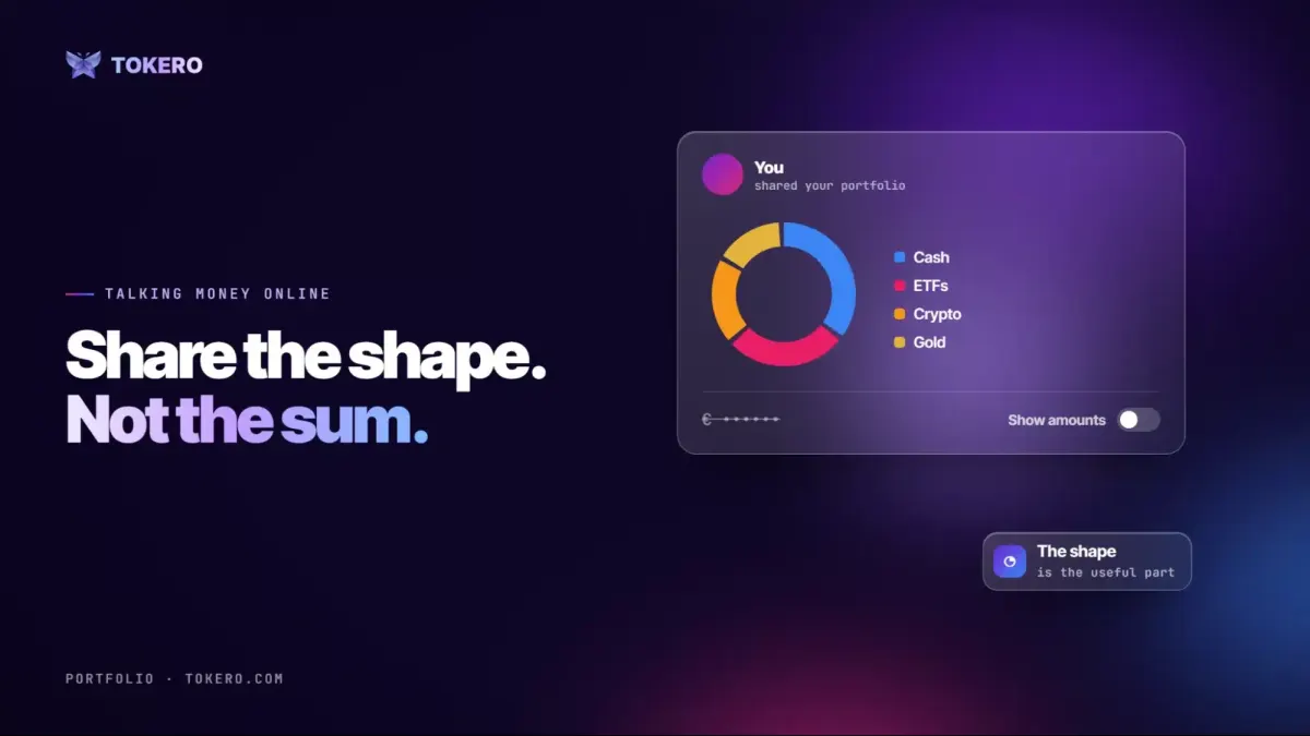
The useful part of a portfolio, for anyone else, is the shape: how much is in cash, how much in crypto, how much in everything else. The amounts almost never help. But a screenshot gives you both or neither.
There are good reasons to keep amounts private. Some people simply don’t like talking about how much they have. Others worry about safety, or about being judged for having too little or too much. And amounts invite comparisons that help nobody: a member with a small portfolio learns nothing from a bigger one’s balance, but plenty from how it’s split.
She found a way to give the shape alone. She put her holdings into a tracker that draws everything as one chart in one currency, and shared a snapshot with the amounts switched off.
She nearly got it wrong, too. Earlier that day she’d turned amounts on to check her numbers, and forgotten. The share preview showed her total right in the middle of the chart. She spotted it, switched the setting off, and watched the number disappear while the chart stayed exactly the same.
It was a small scare, but a useful one. From then on she checked the preview every time, the way you’d check who’s on an email before sending it.
What people saw was percentages and nothing else. That week three members posted their own. For once the questions were about why someone held what they held, not how much.
It changed the tone of the group, too. When people compare balances, the conversation drifts towards who has more. When they compare shapes, it moves to choices: why so much in cash, why that much in one asset, what someone would change. That was the conversation Sofia had wanted from the start
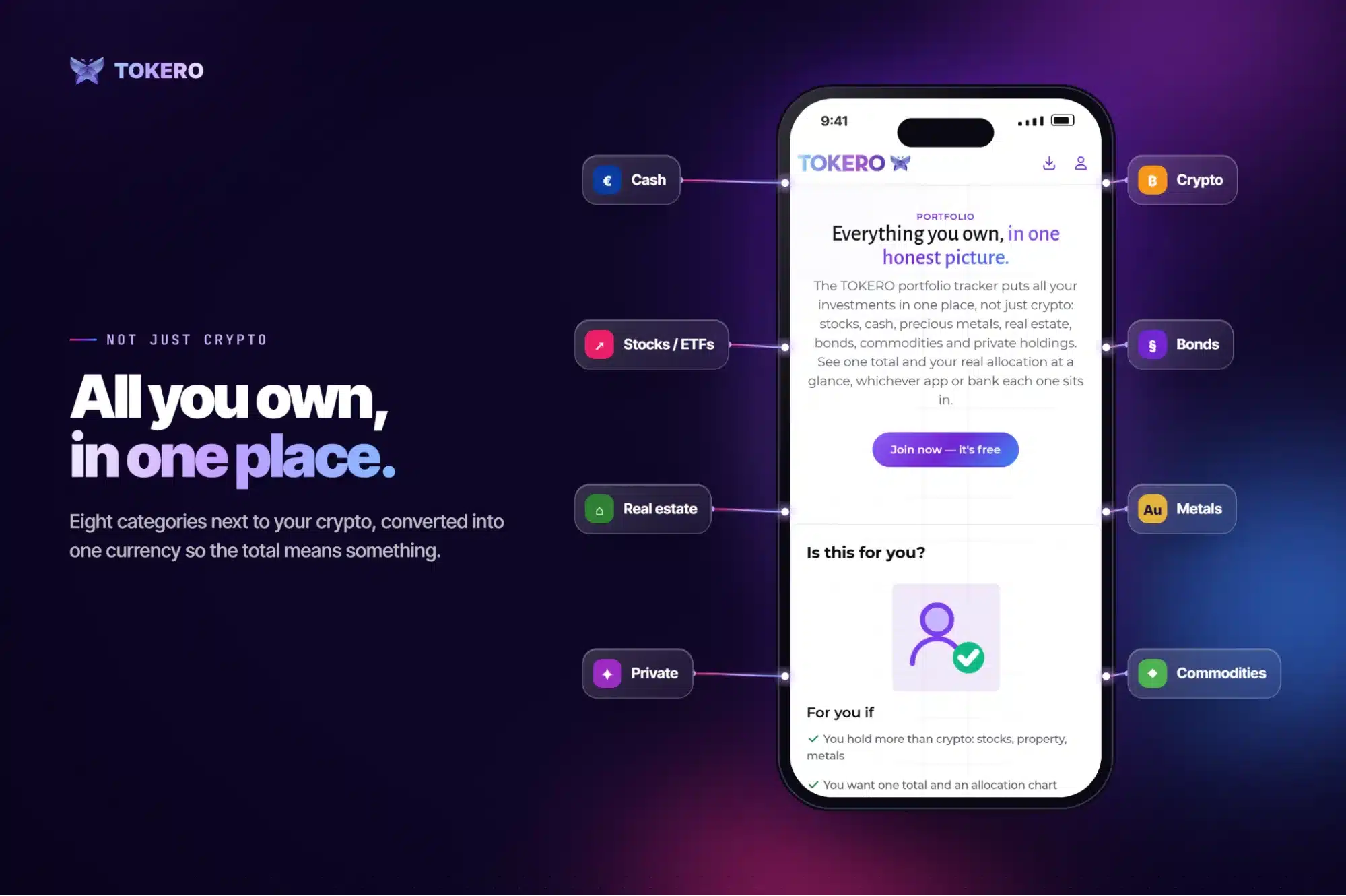
The Portfolio page on TOKERO
She used the Portfolio tool on TOKERO, a social network about money. One setting decides whether visitors, and any snapshot you post, see amounts. With it off, they see the shape only. It’s worth glancing at the preview before you post anyway.
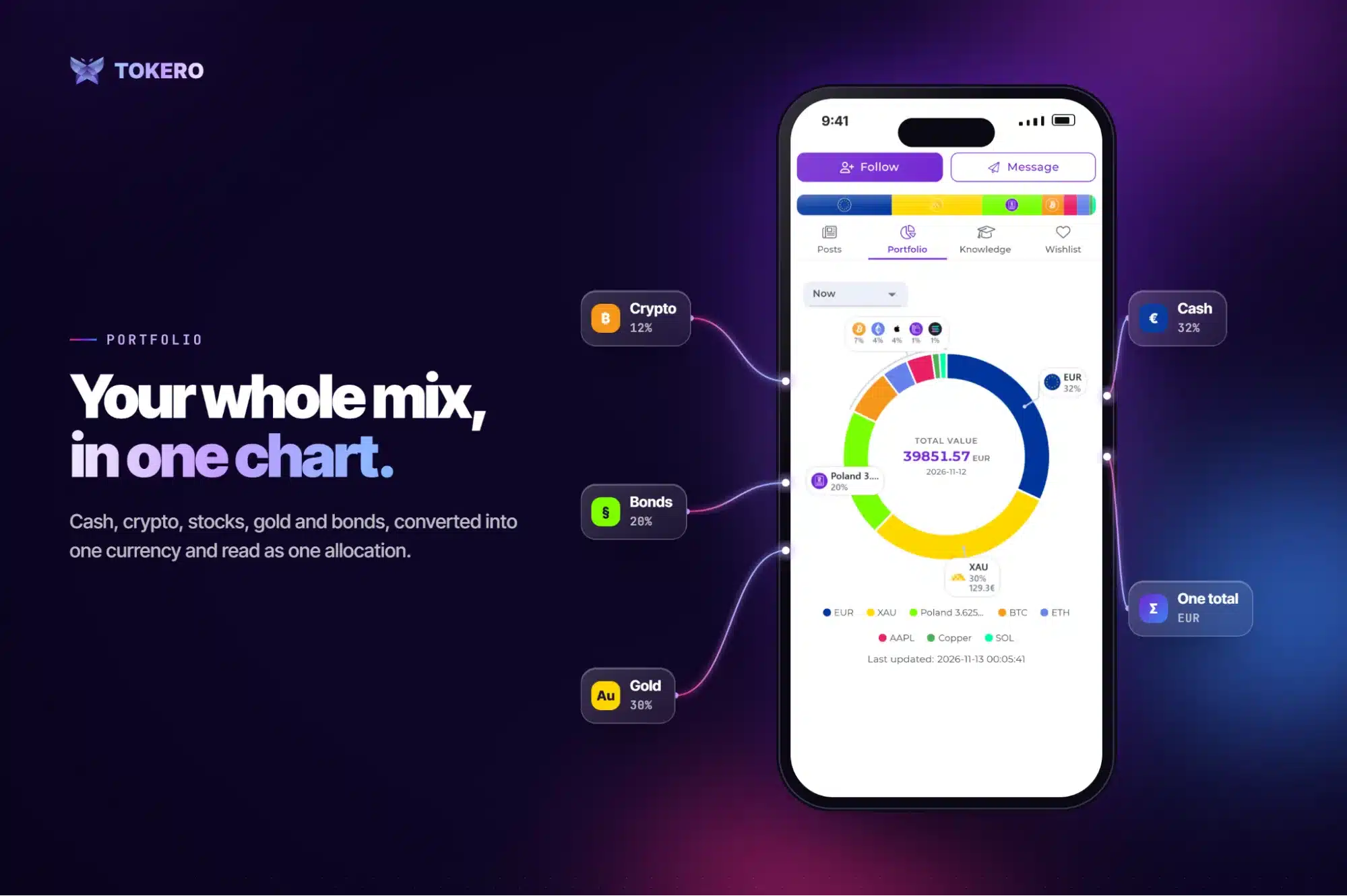
An example portfolio on TOKERO: every holding in one currency, largest first
Listed assets and metals are priced automatically, and the rest you value yourself, across eight categories from cash to private stakes. It shows what you own and stops there: no trading, no moving funds, no telling anyone what to buy. The free plan tracks up to 20 assets across crypto, cash, and stocks/ETFs; paid plans raise that and add categories. If your community is after tips, they won’t get them from this.
If you run a community like hers, it’s worth making that the norm: talk about the shape, and let each person decide whether to say more.
Give people the useful part and keep the rest. Here’s how the Portfolio works.
Octavia Mateescu is a software developer at TOKERO, where she builds the tools creators use to publish and share their work across networks.
Summary for the listing: Sharing your allocation helps others learn; sharing your balances publishes what you’re worth. One setting lets you post the shape without the amounts.
This story was originally published by 36Crypto. Read the original article.